Once upon a time in a land where voice-mail ruled and dial-up drooled, my design inspiration came from snail-mail-delivered magazines and catalogs. Or (gasp) by walking around brick-and-mortar retail stores.
I would rip out pages of those magazines and catalogs and circle things and write notes about where this mirror or that fabric or this couch or that headboard would go. I would sketch out floor plans and use colored pencils to fill in color schemes. And then I would file all this inspiration in a file folder until I could save up enough to afford the couch and headboard and mirror and fabric.
It’s no wonder my home decor once looked like a mix of pages 63- 65 of the fall Pottery Barn catalog, pages 17, 20, and 32 of the Crate & Barrel catalog, and page 4 of Pier 1 Imports. All from the late 90’s and early 2000’s.
Can you say jewel tones?
But in 2015, my approach has changed dramatically. Thanks to technology. Catalogs and magazines have been replaced by e-zines and Pinterest and Google Image search.
And, thanks to the proliferation of DIY blogs and YouTube how videos, my approach to decorating is more high/low with an emphasis on do-it-yourself low.
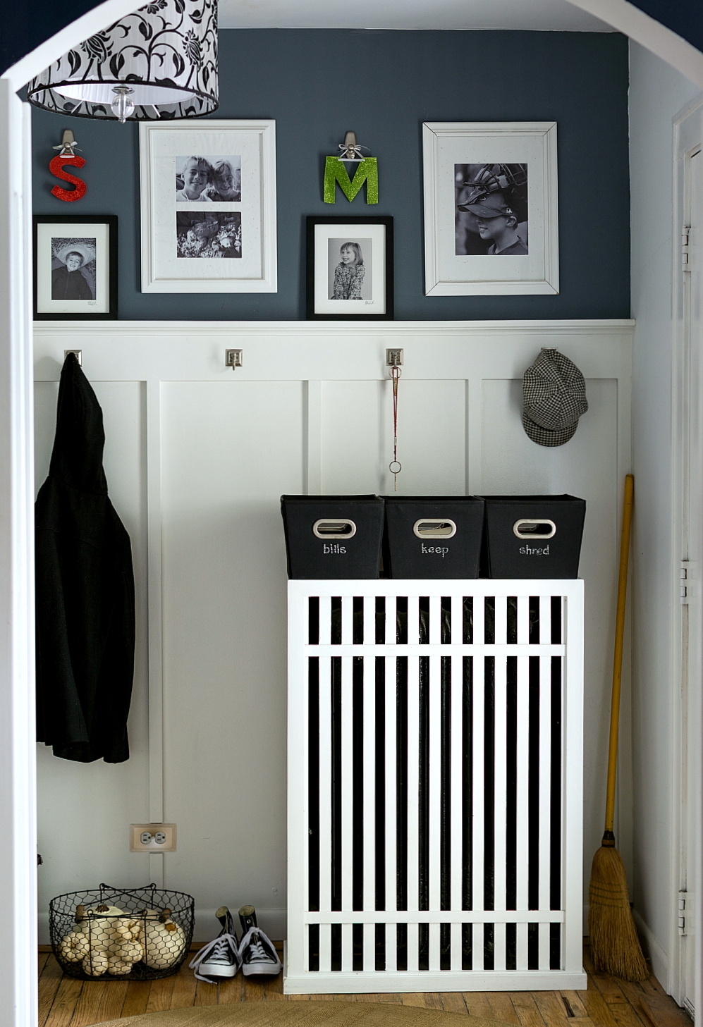
So when Intel contacted me to share how their new Intel 2in1 technology can be used in my DIY, I jumped at the chance. I thought I would give you a behind-the-scenes look at my creative and crafting process as I pulled together, photographed, and create a blog post about a new fall look for the entry.

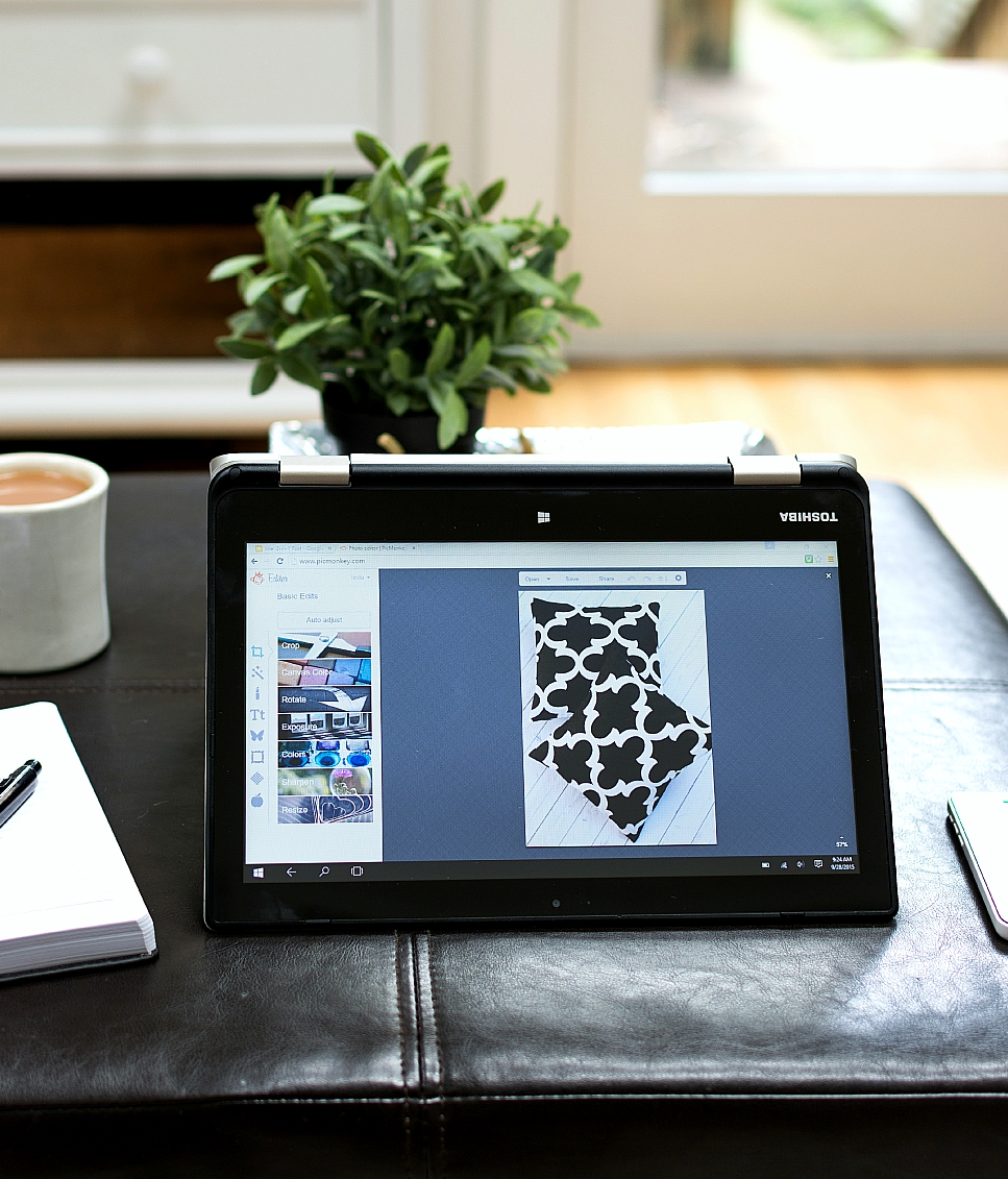
When I first fired it up, I quickly and easily installed Windows 10. It’s free (that’s my kind of DIY), easy to download and use and — most importantly — ensures that my new Intel 2in1 device can easily switch between being laptop (above) and tablet (below) mode.
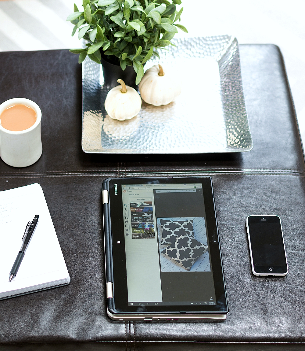
I especially love that in either mode, the touch screen option is available.
So let’s get started. For inspiration, there are some online mood board programs. Some are for a fee, but I prefer free services like Polyvore.
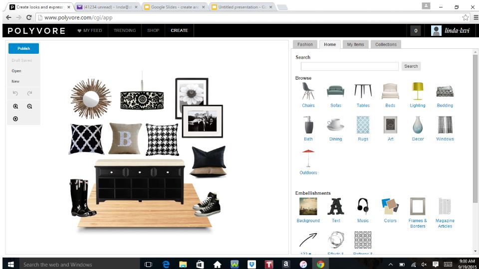
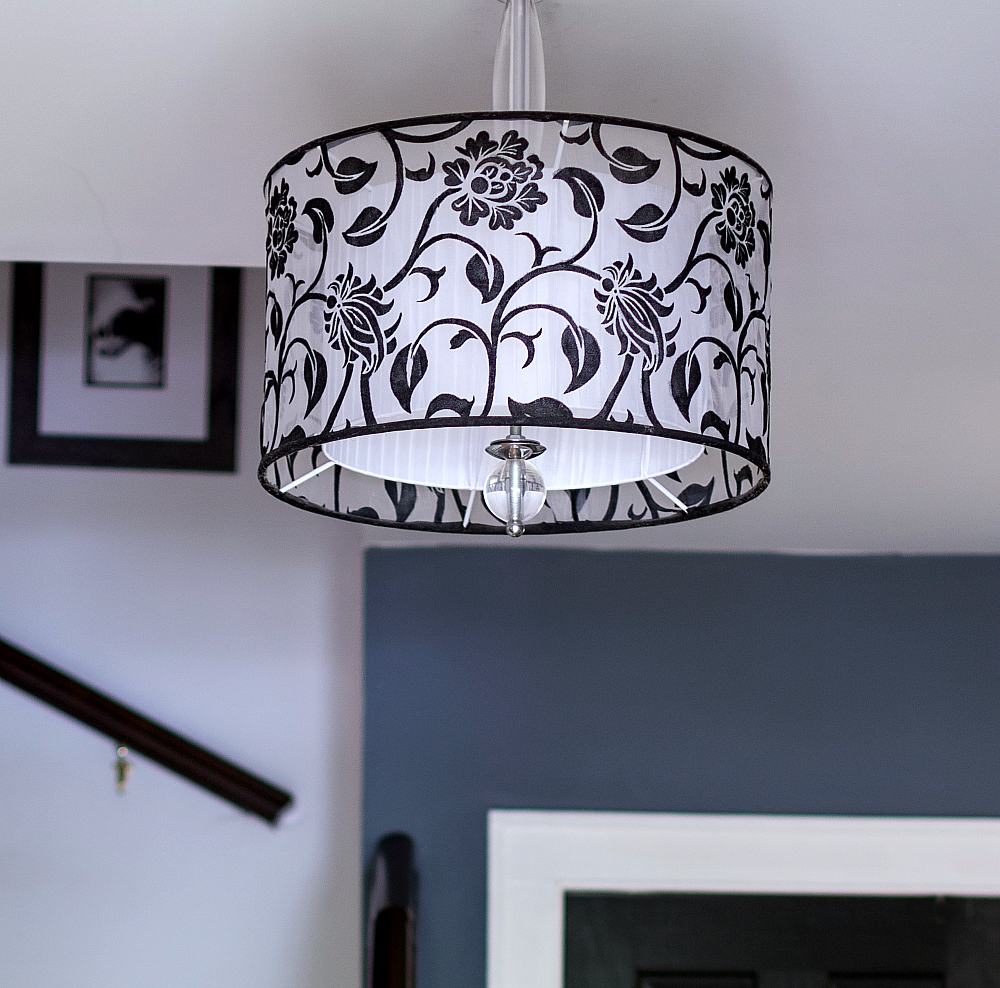
They have a large selection of searchable home decor items, so I was able to pull out some similar existing elements in the entry (a similar light fixture, natural rug, black bench and black & white art), as well as add in some new fabric and color combinations. The touch screen came in really handy as I dragged and dropped and resized inspiration pieces onto my board.
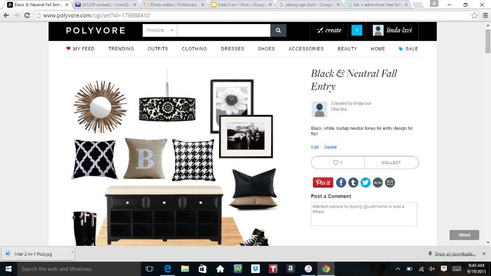
I kept it pretty neutral with black white and natural/burlap. You can save your board along the way and then publish when you get the look you want.
Up next: fabrics. Onlinefabricstore.net is a favorite of mine and I’ve lately been drawn to their large two-color bold graphic prints.
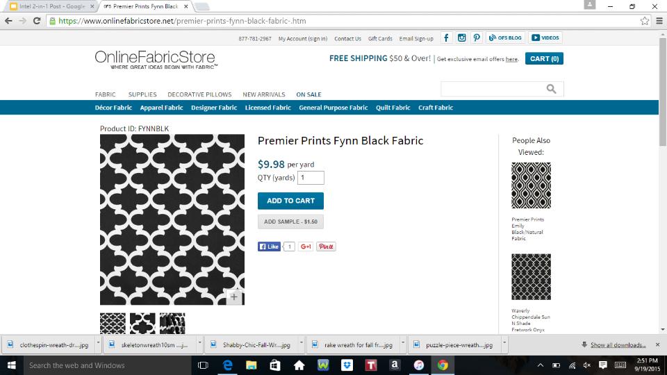
And I especially like the price per yard, so I placed my order for this print and a yard of burlap.
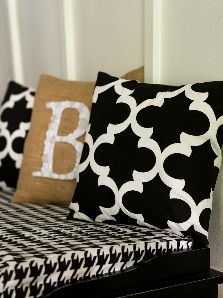
Once it arrived, I create envelope pillow covers for the bench (tutorial here) as well as button monogram burlap pillow that I drew inspiration for form the Polyvore mood board (tutorial for that pillow here).
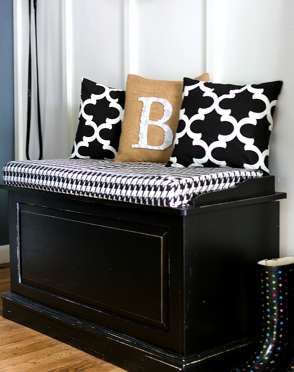
Once the space was pulled together – and cleaned – it was time to take photographs. I use a Nikon 7100, a 35 mm lens and a tripod. Then I just moved the camera and tripod around, snapping lots of pictures at different angles and heights and focal points.
The editing process all takes place on the computer. I download my camera card and do a first pass using an Adobe Lightroom program (a one-time payment but I’m toying with getting the monthly fee Cloud service to free up disc space on my hard drive).
My favorite shots are exported to the hard drive and then go through a second edit using a free online service called PicMonkey.
You can only edit one photo at a time — no batch editing that Adobe and Photoshop offer — but I recently found an easy way to get my images into the editing program with fewer clicks. Just open the folder where your pictures are located and minimize the PicMonkey window (see below).
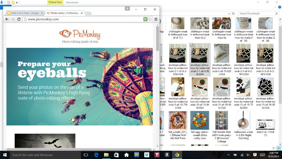
Then click on the image you want to edit and drag it into the PicMonkey window into the appropriate box (see below).
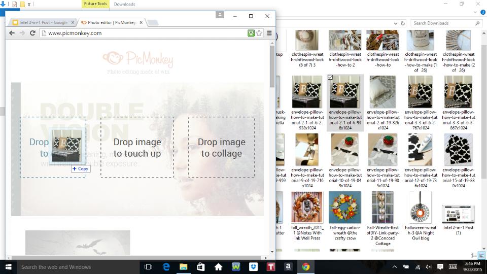
And that’s it. Now you’re ready to edit.
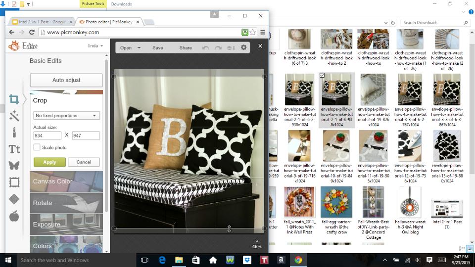
There are a ton of fun options (that I won’t get into here), but you can crop and resize and lighten and darken and adjust exposure and color. And you can sharpen and add overlays and text and more.
And there are times when I like a second set of eyes on an image, and that’s when I can set the Intel 2in1 device up in presentation mode. This makes it easier to scroll through image files with my daughter to get her thought and opinions. Because she has a great eye and is much more decisive than I!
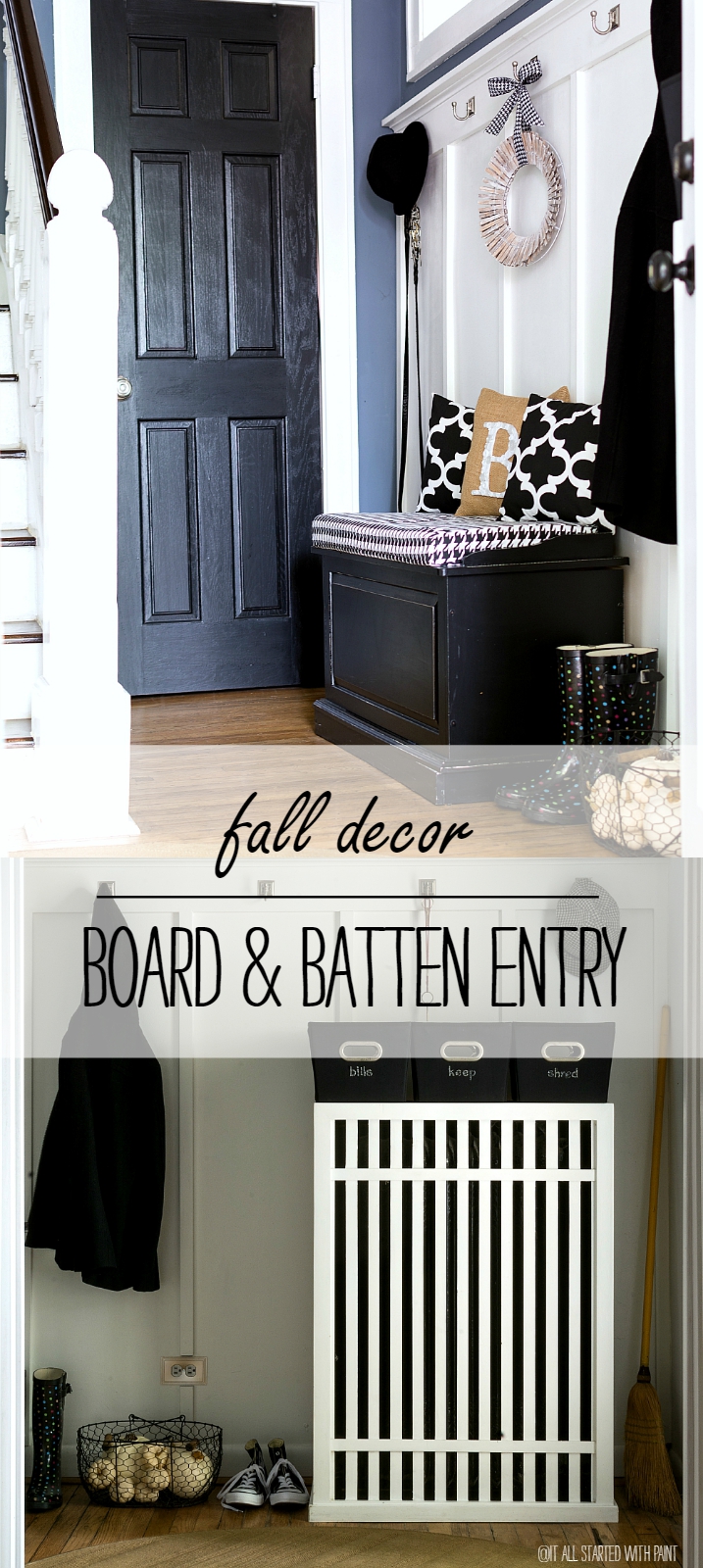
And that’s it. The entry is dressed for fall.
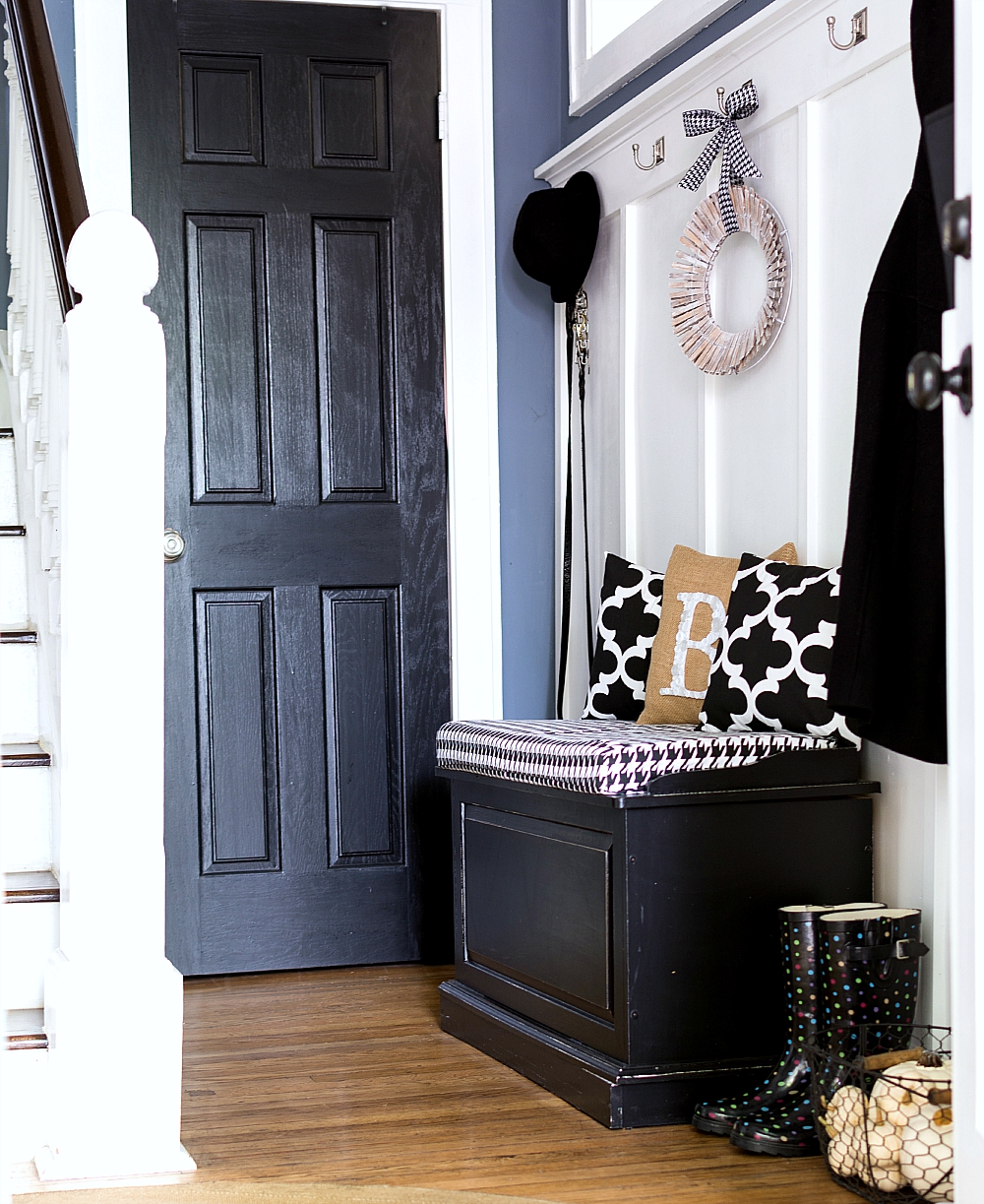
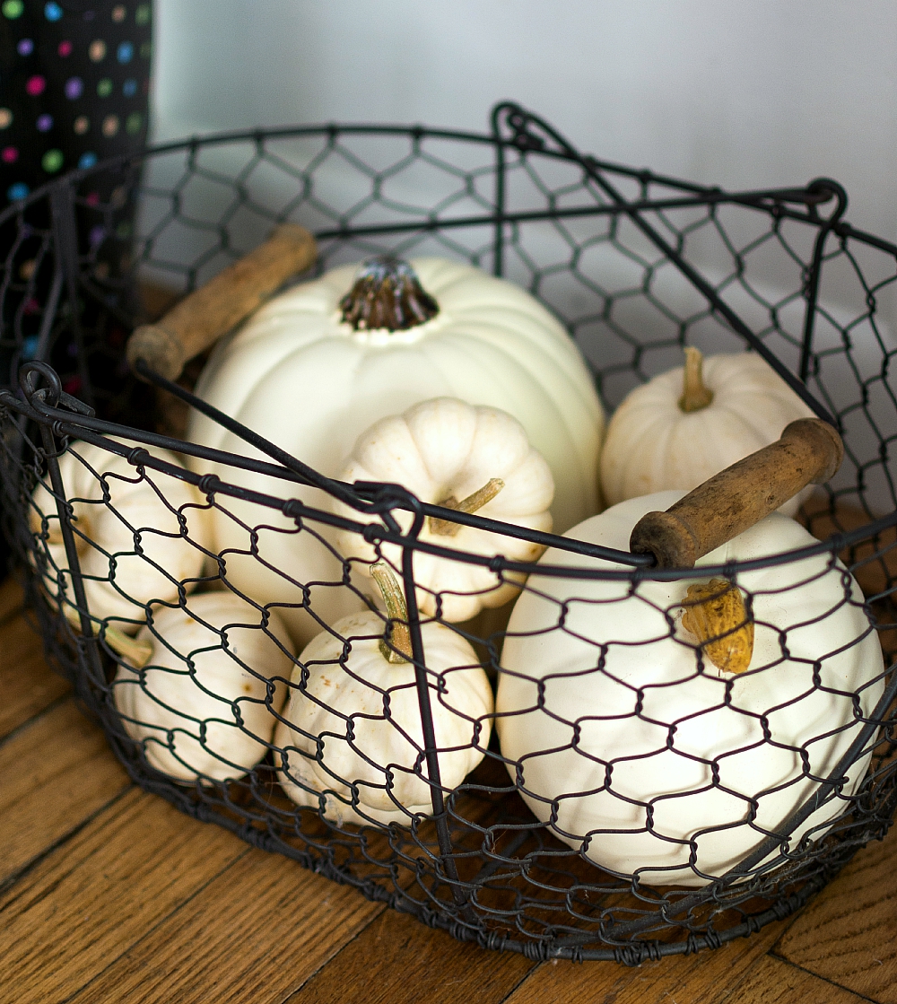
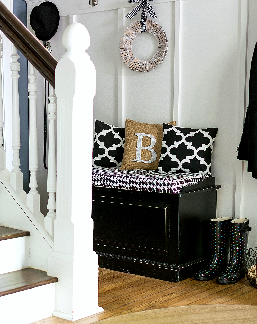

And the Intel 2in1 was instrumental in the entire process from conception to blog post – especially since I was traveling for a few days this week and the device is lightweight and manageable in size, making it perfect for use when you’re on-the-go!
So tell me, how do you use technology in your design and DIY?
You Might Also Like:
#spon: I’m required to disclose a relationship between our site and Intel This could include Intel providing us w/content, product, access or other forms of payment.


It looks so easy – and fun! Love all the black and white accessories. Your home is so beautiful!
Shelley
I need a new laptop–so this is one? (And that pic monkey hint was great–I’m gonna try it!)
It’s a laptop and a tablet all rolled into one. It’s small and lightweight too. Great for traveling — or even moving room to room in your house. I’m having fun playing around with it! 🙂
Dress my entry. It’s nekked.
I guess I say skip the sideways paneling. Board n batten this the new ah so chic name. I just remember Vern Yip making sooo much fun of it in the 2000’s and gleefully ripping it out. Now people are even putting it in as paneling again with a new finish. Unless you could add some insulation with that shiplack!!! JoJo gave us that term.
My mom when she married my Dad moved into an over 100 year old farm. Not fancy woodwork like her uncles built. She and her Mom used wallpaper to keep a wall up. And she sooo wanted to turn it into a traditional home with a house simply built in the 1800’s!! Formal dining room with gorgeous table and chairs we had!! And each Sunday we ate off the good China and the silver and these neat goblets. Mom put a roast in on low while we went to Sunday School and church. She used the style of the day and our home always looked presentable and pretty.
I feel like you’ve done sooo much to your home. It’s new!!! Built in the 1900’s. Chuckle chuckle. But truthfully, it is darling. I can only tackle so much and I have to switch to a place I just want to do with accessories not paint messes and hard work. And then before one knows it its all out of style and Vern Yip would just gasp if he saw my home. Yes I still have my counter tile from 2001 when my house was built. I’m waiting. See? The whole granite phase is already out!!! Just enjoy the labor so of your love for now and enjoy the Christmas decor and making some jar snow globes and painted jars with ASCP and a few German glittered ornaments. Just until you can see the beauty again and that you can do your OWN thing on your walls. I knew a lady that put up sheets of foil one year. That pop up kind from the dollar store. Now that’s something way out there but it was her house. She had a vision and it did look good in the end. Copy everyone yet no one. To thine own self be true!!!!! But is it okay if I copy you??!!! Wink!