Neutral and Gray Living Room Makeover – Sherwin Williams Agreeable Gray
Back in November I volunteered to host Thanksgiving dinner. We were a smaller(ish) crowd than usual. Now grown nieces and nephews were traveling out of state to spend the holiday with their own extended families.
It had been years since I’ve hosted any formal gathering at our space-challenged home.
Needless to say, I was a bit rusty.
But in the middle of it all, I decided to add a little mayhem to the madness …
and completely redecorate our living and dining rooms before that Thanksgiving feast.
That’s something a sane person does. Right?
But to be honest, I’ve been threatening a makeover of these spaces for months.
Okay, more like a year.
I actually bought this fabric in February 2018 from this Etsy shop. And then I just waited and waited and waited for …
I’m not sure.
I definitely needed a push.
To be honest, I work best with a deadline. And hosting Thanksgiving seemed a very logical deadline. And much-need push.
My husband and kids, on the other hand, thought it was completely illogical. And perhaps a bit insane … 😉
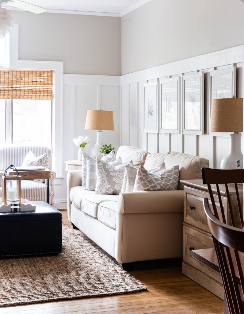
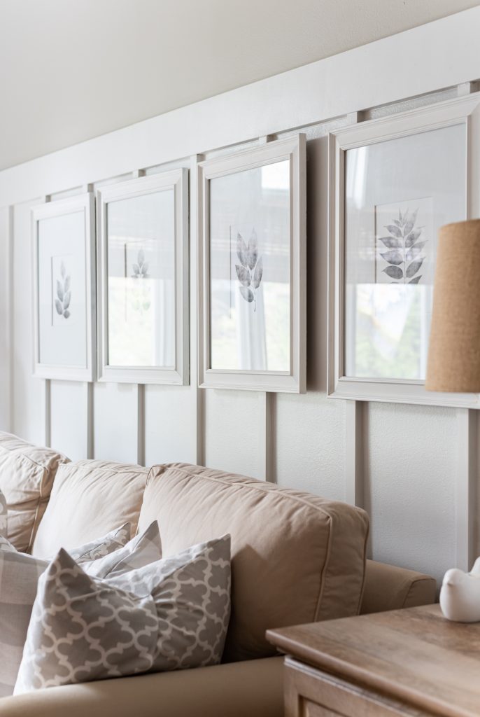
And these prints? These black and white botanical prints from this Etsy shop?
Yeah, I had been hanging to to them for close to a year as well.
The big question, though, was wall color.
I had paint chips of grays that I shuffled and reshuffled for a year.
I wanted something not to dark … not too light. Not too blue. Not too green. Not too purple.
Gray is tough!
And I was working with a self-imposed ridiculously short deadline, so there was no time for a do over.
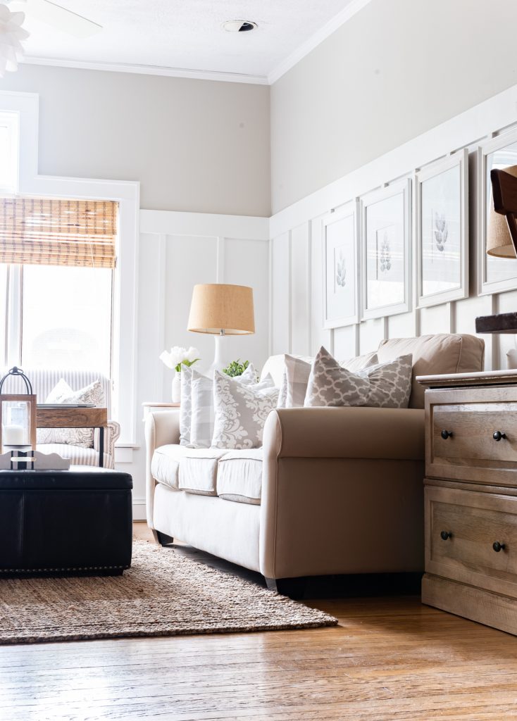
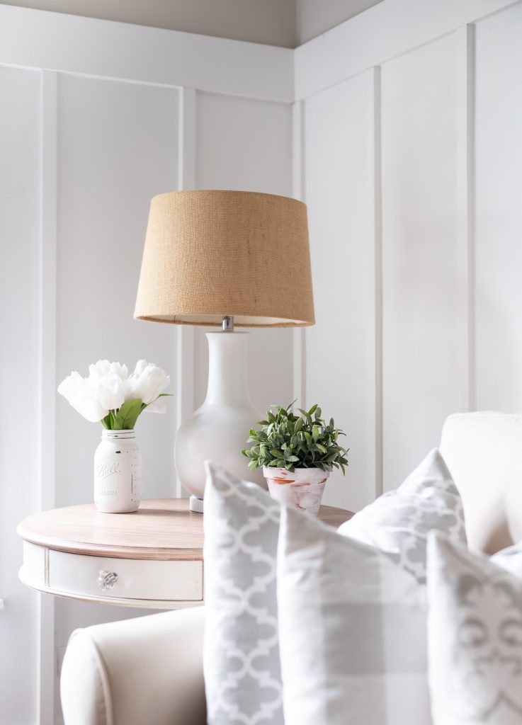
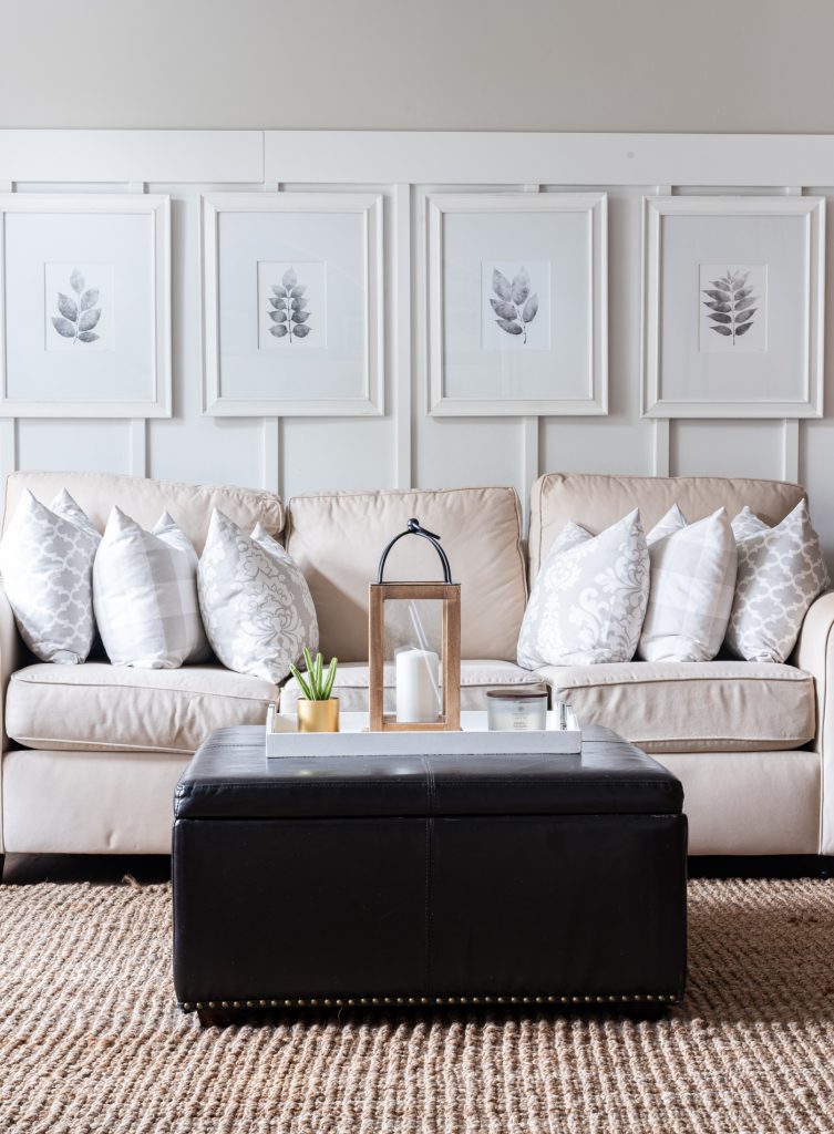
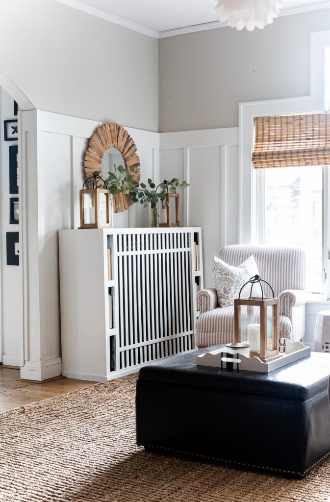
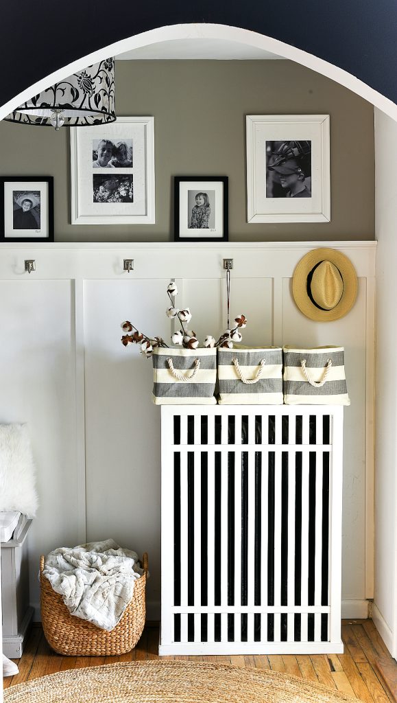
In the end, I picked Sherwin Williams Agreeable Gray.
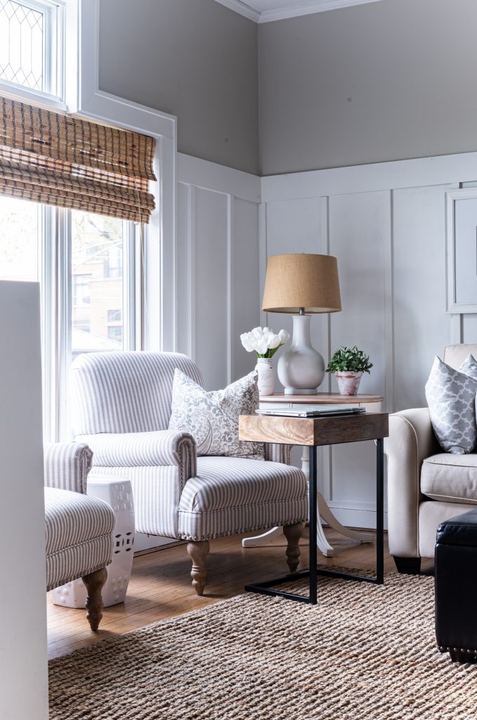
Which is actually a lighter shade and a bit warmer than in the picture above. (See the first picture on this post for a more accurate shade).
It’s definitely more of a greige gray with warmer undertones.
Oh, and I forgot to mention the walls were previously painted a very dark navy (Sherwin Williams Naval) …
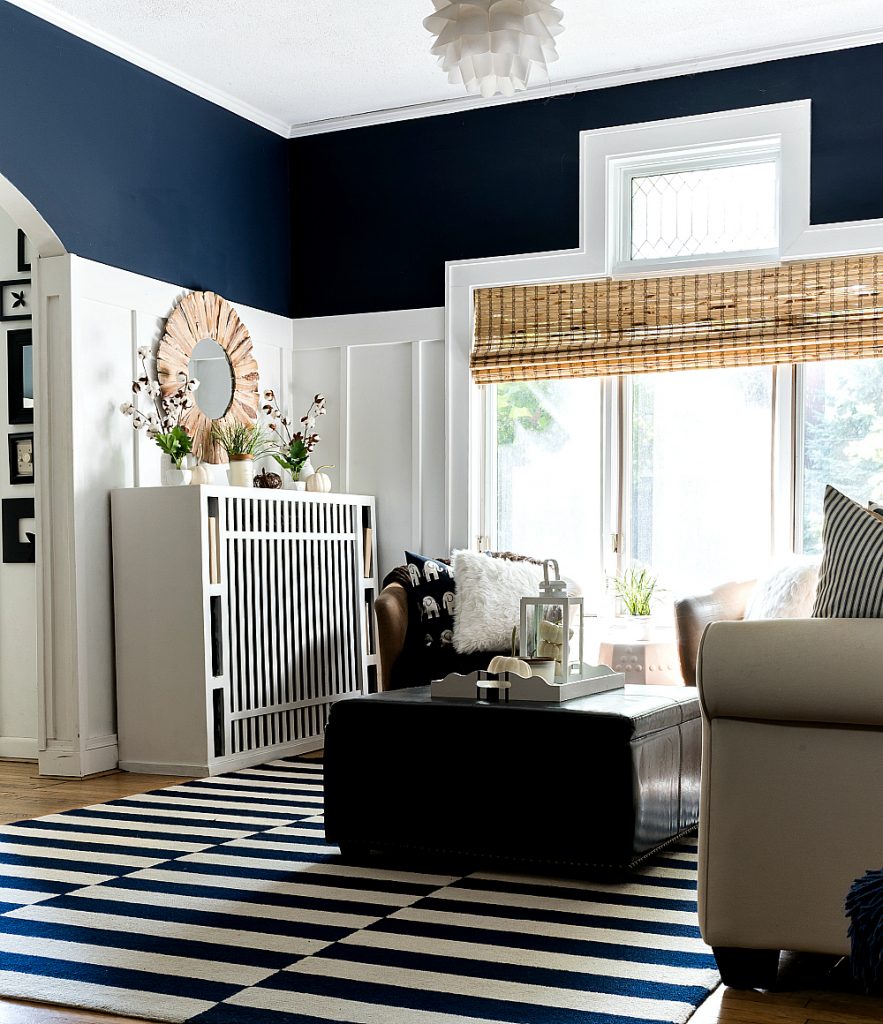
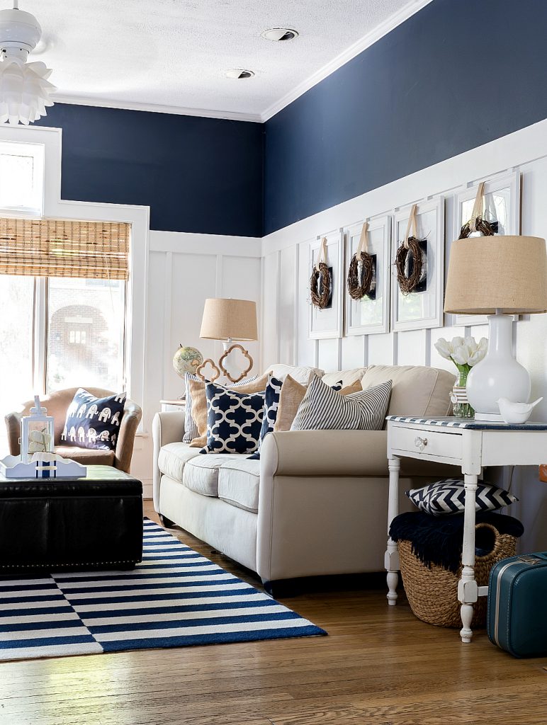
You can see more of my navy & white living room at this link …
Remember?
So before I even opened up my can of Agreeable Gray, I had to reach for the primer.
Followed by two coats of gray.
Sigh.
It was done in the nick of time.
And, as much as I loved my foray into the dark side with navy …
I’m really happy with how much lighter and brighter the living and dining rooms are!
You Might Also Like:
Love the gray, so pretty. The Navy was wonderful too, but I agree with the gray for a lighter look
So glad to read it’s not totally off the wall to change things up just before company! It’s when I am my most creative. I loved the navy but the gray does bring a sense of lightness. I really love your board and batten. Can I ask how high your ceilings are? Mine are only eight feet and I’m afraid it would bring the ceiling down instead of raising it (visually).
My walls are actually 9 feet tall and the board and batten goes up 6 feet, 3 inches. I actually think it makes my walls look taller. I used about a 2/3 B&B and 1/3 wall ratio.
🙂 Linda
I’m all about light and airy too, but your navy version was also beautiful. You have a talent with paint colors!
I so loved the navy walls, but then, the grey is beautiful. You have such lovely decor taste.
Linda, I love the color you picked for the walls! The navy was lovely, too, but that lighter color really makes the space so bright and airy. We have some similar taste in decor, too. Our sofa looks almost the same, and I have those window treatments. Thanks for sharing at Tuesday Turn About!
Linda, this is such a beautiful room. The navy was great, but love the warm gray and neutral furnishing. It makes the room feel peaceful and calm – a great place to hang out and entertain. Visiting from Ducks in a Row.
Pinning and Following!
Linda, your living room looks light and airy, and so peaceful. You have done a lovely job in re-decorating, and I may just borrow some of your ideas! So blessed to see you at Tuesday Turn About!
Hi Linda, I enjoyed your post so much and love the new look. I’ll be featuring you this week on Tuesday Turn About Link Party. 🙂
Hi Linda!
I love the new look you’ve given your room. The color is beautiful and so light and bright. You are one of my feature’s this week at Homestyle Gathering Link Party. This weeks party opened today.
>>> Kim
this looks so serene!
b
Love your living room makeover! I can so relate to your dilemma with the gray! White is the same way. We just moved and I carried that SW fan deck around for at least a month, trying to decide a gray for our MBR (March Wind). I even toyed with Naval! Your choice both warms and lightens your overall space, very nicely. The chair makeover looks terrific!
Rita C at Panoply
This is beautiful! We currently have agreeable gray and our foyer and I’m thinking of adding some wainscoting. What is the name of your white that you used? This combo is perfect!
What is the name of the white you used with Agreeable Gray? Looks fantastic!
Your walls look beautiful. May I ask what paint color you used for the trim and lower half of the walls?