I love clocks. I have one in every room of our house. In fact, in some rooms I have more than one …
tick tock … tick tock.
![]()
And when it comes to my the-more-the-merrier clock philosophy, I’ll add in one more requirement: the bigger the better.
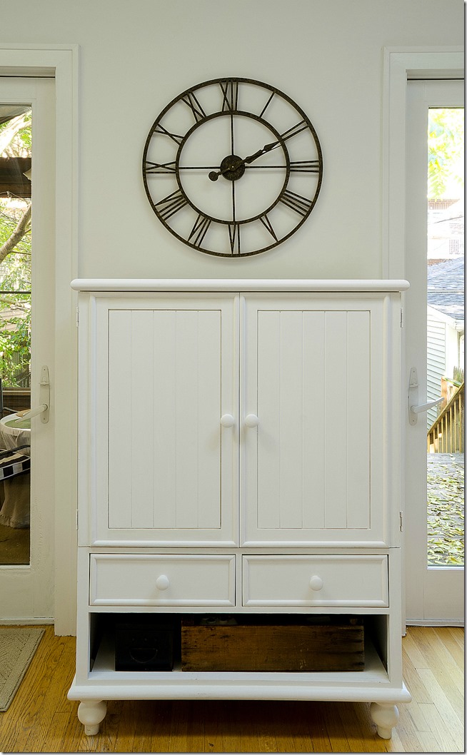
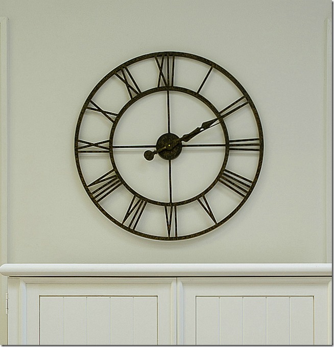
Over the years, my clock purchases have progressively grown larger. Culminating with this oversized 30-incher. A series of sales and coupon codes made it a must buy. So I splurged …
But now I have a question for you, my friends and design enthusiasts. What should I do with the top of that cabinet? Keep it clear? Add a vase or something?
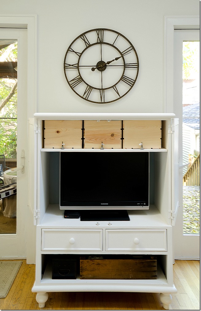
Oh, and I should probably disclose the fact that this cabinet is never, ever closed. It typically looks like this …
And those new crates on the top shelf are on my DIY list. They’ll be stained and distressed and stenciled to look like old wine crates.
So, what do you think?
Linda


i like it as is- simple and lets the clock shine!
I think it looks good with nothing on top. If you feel the need to add something maybe something low.
I like it naked, as well.
I’m leaning towards letting it romp around the family room in its birthday suit …
😉
I like it naked. My question is how, how, how do you keep it that way? My son and husband think blank spaces mean dropping their junk down. I’m constantly decluttering.
I fear that I may be the one guilty of dropping junk on blank spaces … 😉
Janice, I think you’re focusing your efforts in the wrong place. Retrain, girl, retrain.
HAHAHA…if only that worked.
We used to have a place like that. I taped up a sign that said PLACE TRASH HERE. Voila. They took the hint. 😉
Your clock is gorgeous by the way.
I would suggest to experiment with different items your have around your home for displaying on the shelf.
A large wall clock should be at least 8 inches above your mantel or shelf.
Symmetrical designs often feature a tall item on the left and right ends of the mantel, such as a set of candles and candlesticks, two tall topiaries or vertical vases with flowers.
Keep the height of the items at least 6 inches shorter than the height of the clock to create a harmonious design with formal appeal.
Include decorative elements that coordinate with the color and style of the room for best results. Accessories such as a stack of old books, a tall sculpture or vertically oriented pottery piece are wonderful choices. To balance the display, add an item that is 6 inches shorter than the decorative element on the right side, such as a small globe, potted plant or small plate, to balance the informal mantel design.
Select a collection of decorative items that are similar in terms of color and height, and place them across the mantel shelf in 4-inch intervals. Accessories, such as cream ironstone pitchers, large decorative paperweights, mini world globes or votive candle holders are perfect choices for this simple design. Horizontal displays are appropriate for any style home, and they create a stunning display without a great deal of effort.
Or you can add a couple small framed photos on one side and maybe something a bit taller like a vase on the other side and leaving the center part of the shelf empty. You just don’t want to make a display of things going all the way across your shelf or mantel. You don’t want to take away from the beauty of the clock.
When not in use; I would also keep the cabinet doors closed
Wow, Colleen! So much fabulous advice and ideas!!! I’m sitting here taking notes — and now worried that I didn’t hang the clock high enough. Need to pull out my measuring tape and check that 8 inches!!! 🙂 Linda
In your particular case, you have the clock centered in the space available between the top of the cabinet and the top of the windows. If you raise the close, will it extend above the woodwork? That might look weird.
A big thumbs up…I love the clock and it looks perfect in that space over the cabinet (open or closed!)
Linda,
I love the clock by itself. It lets it be the focal point. Love that clock.
Kris
wow! I also love it All.By.Itself. , such a statement!
Check out http://www.stemsvases.com – and you could place a seasonal arrangement for a bit of nature. I have several of these and they have been a perfect compliment to our decor.
Thanks for the great tip and link!!! 🙂 Linda
Well, rumor has it that you will have a senior picture soon to put up there. This is a good place for a couple of well framed photographs. Just a couple. Or, there’s nothing wrong with nekid.
I love the look you have, especially when the doors are open. I too love clocks! Something about clocks that make me need just one more…and one more….
Love these